Keywords: Stacked Bar Chart, Data Labels
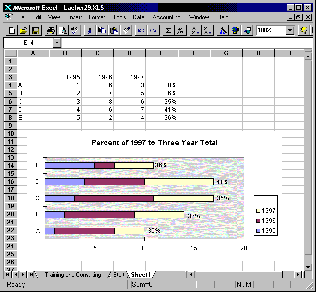
Description: Example of special data labels on stacked bar chart. The data labels show values from the source data range of the chart, but the series associated with the labels is hidden so only the labels are visible on the chart.
Tip: You can add special data labels to a stacked bar chart and have the labels display percentage values. If you create the percentage values in a column in the chart's source data, you can display the series of percentages on the chart as a hidden data series. Even though the data series is hidden, you can have it display it's values in data labels. The result is a chart showing actual values with data labels showing percentages.
Guide to the Example: The chart is created with columns B - E on Sheet1. The data series containing the percentage (column E) is hidden on the chart by setting its pattern to none and border to none. Even though the series is hidden, it still displays values as data labels.
Download File: Click Here
Tip: Click on the link above and choose
"Save" to download the xls workbook to your hard drive or "Open" to
open the workbook inside of your browser.